Tuesday, October 26, 2010
Monday, October 25, 2010
Tuesday, October 19, 2010


Torn Text
 I actually took a longer time than I thought I would on this, it was very easy to fiddle with and try to make perfect.
Monday, October 4, 2010


Thursday, September 30, 2010
Sketch Effect


I don't like this effect. It takes away all the detail and color of the photograph, making it look very 2-D. My first attempt is a car brakelight, and I made it darker than suggested so the subject was actually visible. My second attempt was too boring so I added a Colorize effect that was somewhat Maroon. On my last attempt, I just took every adjustment to the extreme so my image would turn out dark and posterized looking in a soft way.
Black and White with Color Focal Point


 I started this effect with the red flower and the sharp edges of the flower selection worked well, but when I moved to the other photos it made the flower look out of place. Therefore, I copied the flower layer and applied a Gaussian Blur Filter Effect to the bottom flower, making the edges glow and blur enough to make it not seem odd.
Wednesday, September 29, 2010
Mapping Textures

 The photo in this effect's instructions is really creepy, so I'm impressed with how cool it actually looks. I like how it adds extra texture and dimension to a photo. The little monster thing with pearls has the effect applied to the pearls because I wanted to see how the effect worked on something that wasn't a focal point.
Painter Effect

 After my first attempt on the fire hydrant, I adjusted the angle of the Motion Blurs to see what happened. Using the Smart Filter was surprisingly easy.
Water Reflection

 The displacement map on the bus version of this was REALLY HARD! The lines were too small, even when I adjusted the settings to make them larger. So, I made the image I worked with smaller. In the end, my water ripples are still very small. The forest reflection is a picture I took off the internet.
Photo In A Photo

 With this effect I experimented with the size of the photo background thingy... I used a picture of many smaller flowers as the photo in the photo.
Watercolor Effect


This effect was really fun, and I especially like how it brought out the colors of the roses. I don't really like the picture of the cat, however, and that one took quite a while to get to the point where its acceptable in my book.
Wednesday, September 22, 2010
Monday, September 13, 2010
Saturday, September 11, 2010
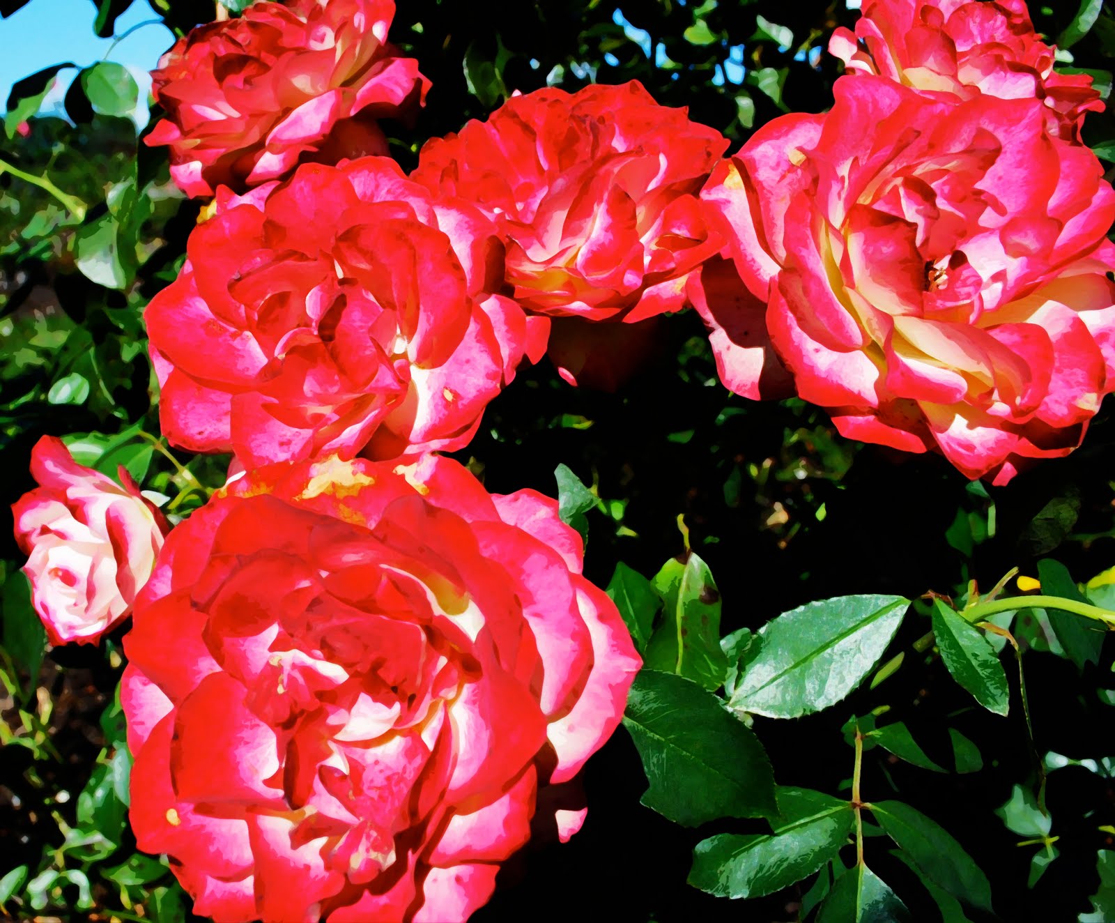
Rose Garden


I am so glad we had this assignment!! It was gorgeous outside and having an excuse to go to Lake Harriet was awesome. It was difficult to choose my favorites in this assignment because I thought they were all somewhat similar, but I decided that I loved the bright color in the magenta one and the simple elegance of the white one.
Friday, September 10, 2010
Aperture

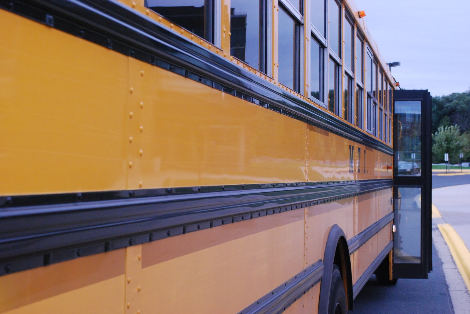
Using aperture is a really fun ability to have. With it, I could take the picture of the flower to add dramatic effect. Also, the picture of the bus had a better focus because the background was blurry and less important.
Tuesday, September 7, 2010
Polaroid Collage

In this effect I used a close-up of my cat, Buddy. The photo was more detailed in his face, so I used a high concentration of polaroids in that area in an effort not to leave any detail out. I also tapered out towards the edge of the photo to place more emphasis on his face.
Warped Photos

This one was actually really fun. None of these pictures are my own however, I just REALLY want to go to the state fair and ride on carnival rides...
Emulating Lee Friedlander


I used Lee Friedlander's America by Car series as inspiration this weekend. I brought my camera on every errand I ran this Labor Day Weekend and attempted to replicate the style. My pictures do not have the interesting subject matter that his posses, but I think I got the angle and the idea right. The color photograph is much more my style, it was a happy accident and I love how the angle is just awkward enough and the sunset is making a fuzzy light burst in the corner. The other picture is, in my opinion, the best version of the more "Lee Friedlander" photos I took. The lighting in the car is great and the subject matter outside isn't just trees, its actually a closed road.
Friday, September 3, 2010
Interwoven Photo

This photo looks really cool with the interwoven effect because of the brightness of the color and the strangeness of the subject. I made the "Outer Glow" effect a little more intense than suggested because I wanted the effect to reflect the intensity of the color.
Text with Face

This was a self-portrait I made in the summer while I was bored. I put the first two chapters of the scarlet letter over myself because I love the Old English language. The orignal image didn't have much contrast, so therefore this one doesn't either. However, like the the Chuck Close paintings, if you look at it from farther away its a little better.
Thursday, September 2, 2010


Tuesday, August 31, 2010
First Assignment for Media Arts 2! 15 Picture Collage

I usually don't like making collages, but this collage was fun to make and looks nice because I made it square instead of an awkward rectangle. I also made a copy of the collage and then used the blending mode "soft light" to create more contrast so the images pop more than usual.
Wednesday, June 2, 2010
Last Assignment!


This assignment was a lot of fun, free reign on an 8.5 by 11 sheet of paper!! I used the band The Swell Season for my inspiration. The flowers are done using a modified version of the Pop Art effect from Assignment 8 and a modified version of the photo cubism effect using the "Overlay" effect.
Wednesday, May 26, 2010

Monday, May 24, 2010


Thursday, May 20, 2010
CD Booklet and Sticker


I made my own CD Booklet and sticker for Andrew Bird's CD Noble Beast. I loved using the peacock pictures in this and edited the one on the inside of the booklet to look similar to the one on the cover. Before this assignment Illustrator was confusing and frustrating, but now I think its actually a lot of fun!
Tuesday, May 11, 2010
Photo Cubism Project


I used pictures of the Cherry on a Spoon in the Walker Arts Center's Sculpture Garden for this project. I used photos from mostly the same angle give or take a few degrees and two photos of the cherry from an angle by the spoon's stem. I also liked using pictures from different seasons and on different days.
Subscribe to:
Comments (Atom)
